Note: this is not a news post. This is a bonus post looking back at the history of BABYMETAL during their “seal”.
The BABYMETAL logo has remained virtually unchanged almost since the start of the band’s history, with a few differences in color, 2D/3D, and a few more variants. But though all of these the elements themselves have remained unchanged (except for the very first version of the logo, which we will get to in a minute).
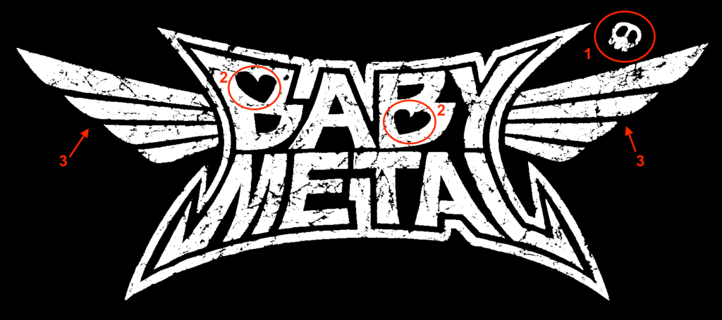
Looking at the logo, we can see, apart from the letters themselves and the style that there are 3 elements:
- The skull at the top right
- The hearts inside the B’s
- The wings to the sides
Not known to many BABYMETAL fans, each of these elements come from the 3 founding members of the band, SU-METAL, YUIMETAL, and MOAMETAL.
YUIMETAL’s is probably the most known. It’s a drawing of a skull she made.
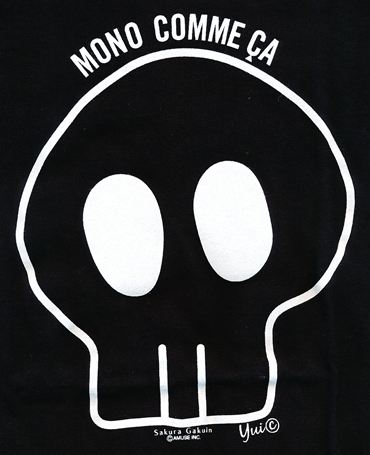
She drew it for the very first Sakura Gakuin show, where the members were asked to design their own take on the Sakura Gakuin logo. They wore their logo’s printed on t-shirts for that performance.


MOAMETAL’s element, the hearts, also came from the same event.
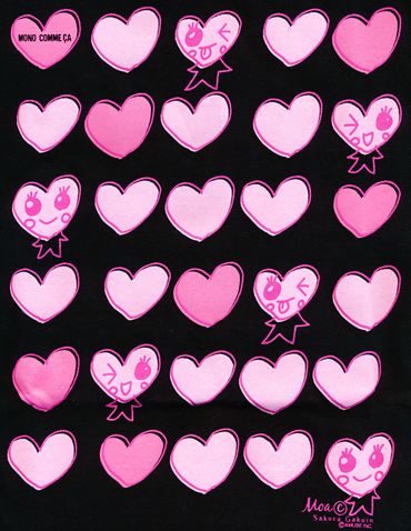
The hearts were more clearly visible in the Doki Doki Morning single artwork cover.
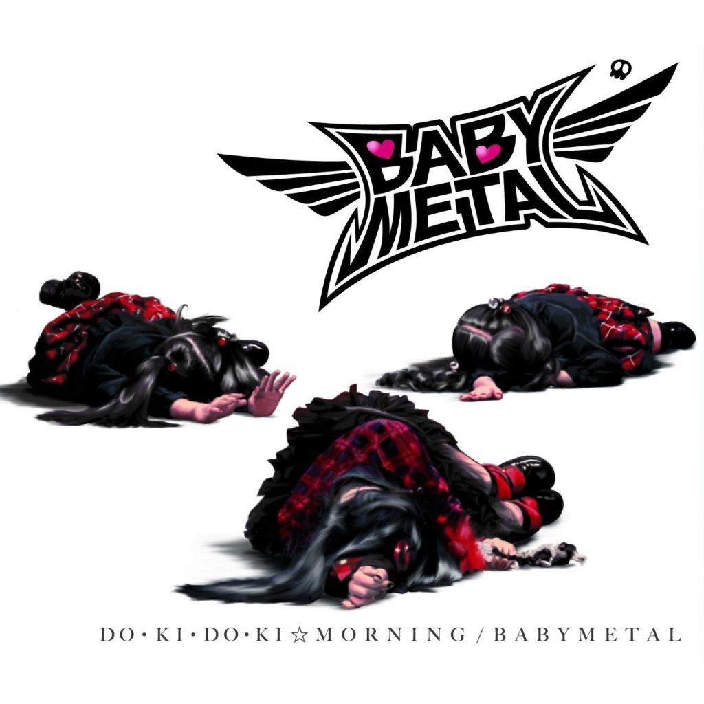
Last, but certainly not least, comes SU-METAL’s contribution. She actually made 2, but the first element did not remain, and was switched to another one.
The first element was her signature Su “S-bolt”, and appeared only in the very first appearance of the BABYMETAL logo in Sakura Gakuin.


This was later turned into the wings we can still see on the logo today. The wings come from a song, “My Wings“, in her first band, Karen Girl’s.
MASSIVE credit goes to jabberwokk and those that helped them make this post several years ago.


2 Comments
Samuel Mills · January 4, 2022 at 11:12 PM
Thanks for the small history lesson from a old new fan.
Maiurice · January 8, 2022 at 6:33 PM
I did not know that. Thanks